Monday, 29 June 2009
CD Cover Ideas

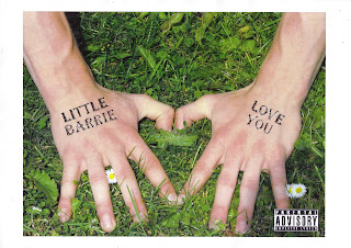
These are two sketches of ideas for our CD Cover.
They are just ideas that popped into my head which connected
or reminded me of 'love'. The roses represent love in many ways
as they are a flower which you give to someone you love or you
recieve them from a fellow partner. The clouds and sunshine are
just to fill the cover with happy, meaningful thoughts.
The title and author are spread around the cover where possible and
where it looks good to fit in an appopriate place.
Friday, 19 June 2009
Music Video Analysis
Lady GaGa -- Poker Face:
This music video is all about Lady GaGa hiding her face behind a mask. This shows her putting on a poker face when playing the game, which is all about keeping a straight face and not showing any emotion. The video seems to revolve around a poker game with people concentrating and keeping a straight face, but without Lady GaGa's mask she doesnt have a poker face unlike everyone else. The video also seems quite sexual, as she wears different types of sexy clothing and dnaces around into different positions, its almost as if she is a sexy commentator, watching the moves through her mask.
Dizzee Rascal -- Bonkers:
This unique video is shown exactly around the title. For example Dizzee Rascal has a sharks head on, which is seen as crazy or as in this song, Bonkers! The video is alot of crazy and unique stuff put together randomly to show the audience what they want to see from the title. Which means the producers have worked from the title to build up a random but yet significant video to catch the audience's eye and keep them happy. The video overall is good and keeps to the title making the whole song and video 'BONKERS' from start to finish!
Akon -- Beautiful
This video revolves around Akon being in the centre of many different 'beautiful' women. For example at the start of the video there are different camera shots of different women in different outfits and in different pose's, there is then a camera shot of Akon obviously watching the women as more camera shots come in of even more women. This lasts for the first 17 seconds of the video which may show that these women are ment to be shown as 'Beautiful' and Akon is the one singing about them! Through the video there are another two lads who join the song and also join the women as they dance round the three of them. If its not a shot of Akon and the other two then its camera shots of the women. So overall the Video conveys exactly waht the title says once again but towards the women and how men can be respectable towards them.
Tuesday, 16 June 2009
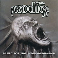
Prodigy -- Music for the Jilted Generation
 This album cover seems very weird but matches the headline of 'music for the jilted generation'. It shows the dead / horrified head at a 'jilted' angle, and the death of the head may convey the generations to come for prodigy. The album cover seems quite eye catching and random, and the picture shows what type of audience will be listening to the CD. From the Cd Cover it seems as if Prodigy has a Hardcore, Rock style. When if you listen to it, it mostly is a Dance, Hardcore, Trance style. So the picture shows exactly what the audience want to listen to.
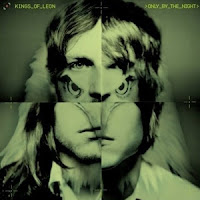
Kings of Leon -- Only by the Night
 This album cover shows the title very well as the the title is 'only by the night' and the picture is of a human and a barn owl mixed in 4 different corners. This is good as owl's dont come out in the day there only out by the night. Which means the picture for the album cover covers the the title in every-way possible as there is nothing else the picture can say about the the title. So once again the picture has been worked on from the title, it's also obvious that the title was thought of before the picture. This is because Kings of Leon aren't really signified by a barn owl, therefore they wouldn't really put one in their album cover unless they had a title like this one.
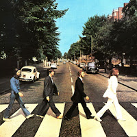
The Beatles -- Abbey Road
 This album cover is unique as it wasn't actually going to be called 'abbey road'. The Beatles' photographer had only 10 minutes to take this photo, which is why one of The Beatle's, McCartney, is out of step and time with the other three. The picture for this is so easy, but yet so significant towards the album as the road is 'Abbey Road' and to this day is a popular destination for fans of The Beatle's. Also this particular album cover is one of the most famous and the most imitated in recording history. So easy, correct, quick, imaginable and simple but so famous!
Wednesday, 18 March 2009
Evaluation 4
How did you attract /address your audience:
One of the main ways in which we attracted our audience was by using actors of a younger age in order to try and attract the same aged audience. Another way we attracted our target audience was by using themes that our commenly used in films of that age range.
What I've learnt about technologies:
One of the new technologies we have learnt about is the imovie program. We had to use this to edit all of the shots together. We also used it to add any other little bits of editing we used such as titles and transactions. Another form of new technology we have used is the digital video cameras for filming the opening film. We realised that the cameras were capable of much more than we first realised, there were settings on the camera that enabled to change things such as brightness which enabled us to change the lighting appearance for certain scenes where we couldnt get the lighting right in the factory.
Tuesday, 17 March 2009
Evaluation 3
Lighting:
Because we were a low budget company we didnt have the money and resources to create professional lighting so we used our knowledge of the layout of lights in the factory to create what he had envisioned. The low key lighting creates fear and tension as in the dark, people become very vulnerable as they are unaware of their surroundings. The shot where the character walks from darkness to light creates a silohette, a clever shot used in many thrillers such as when Freddie Kruger is introduced in 'Nightmare on Elm Street'. It creates a feeling of a mystery about the situation as you can see the character but not clearly, a metaphor for not seeing the whole picture.
Who would watch the Film?
The film was aimed at people aged between 15 and 24 years, this was mainly because of the themes that were involved in the plan for the film. Films that are aimed at this particular age group usually contain themes such as comedy, romance, horror, murder etc. Most of the the themes we used fell into this category. Therefore we decided to aim it at this age group, also that group is the most popular cinema going group.
Media Institution Distributions:
As we are a low/no budget company it would be proposterus to think that it could achieve the same status that higher budget films achieve such as cinema showings and DVD's. It would be much more realistic to assume that institutions such as 'MySpace', 'Facebook', 'Bebo', 'YouTube' and other online sharing sites would distribute our thriller on their pages. Many people post short films on the internet and though not earning money they are still earning recognition which can then lead to actual filming jobs. The sites would be perfect for our film as it costs nothing to post a video on the internet, so our non-existant budget wouldn't be affected.
Subscribe to:
Comments (Atom)


